Description
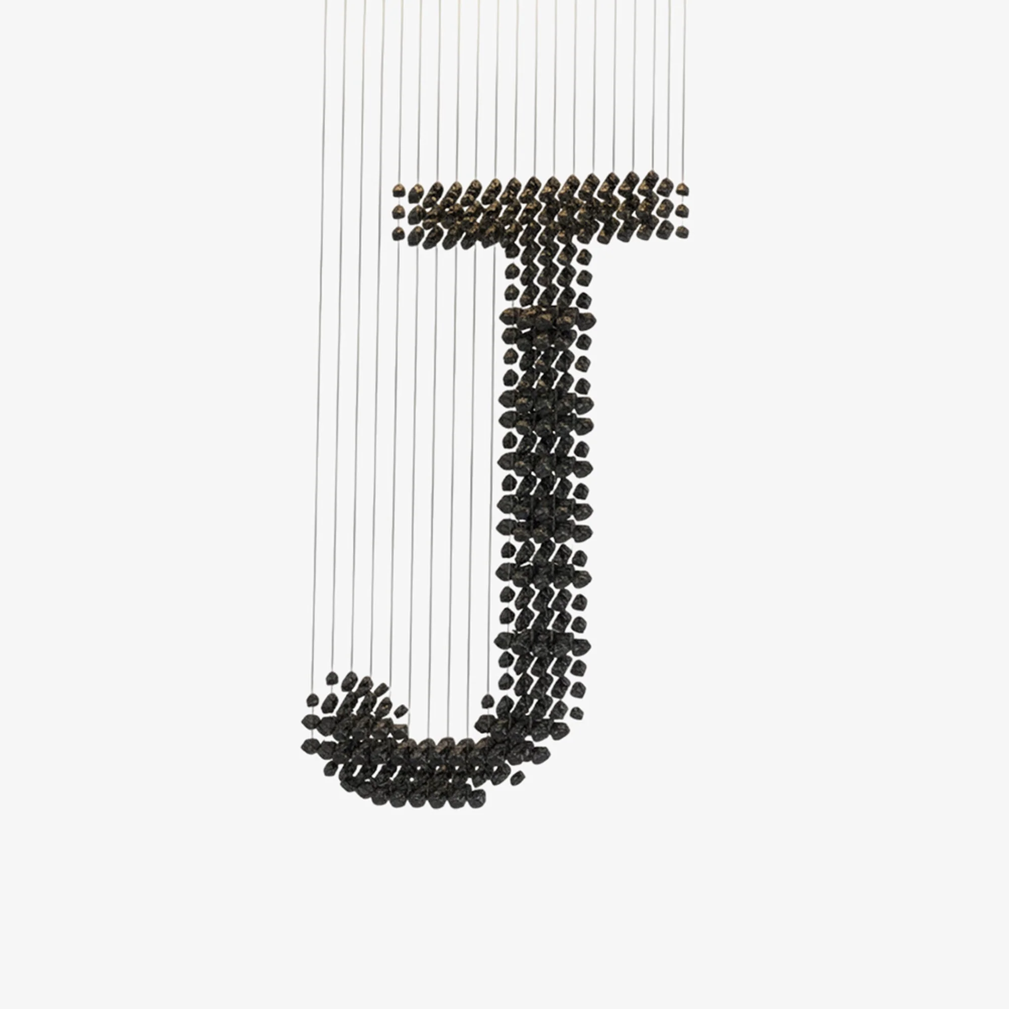
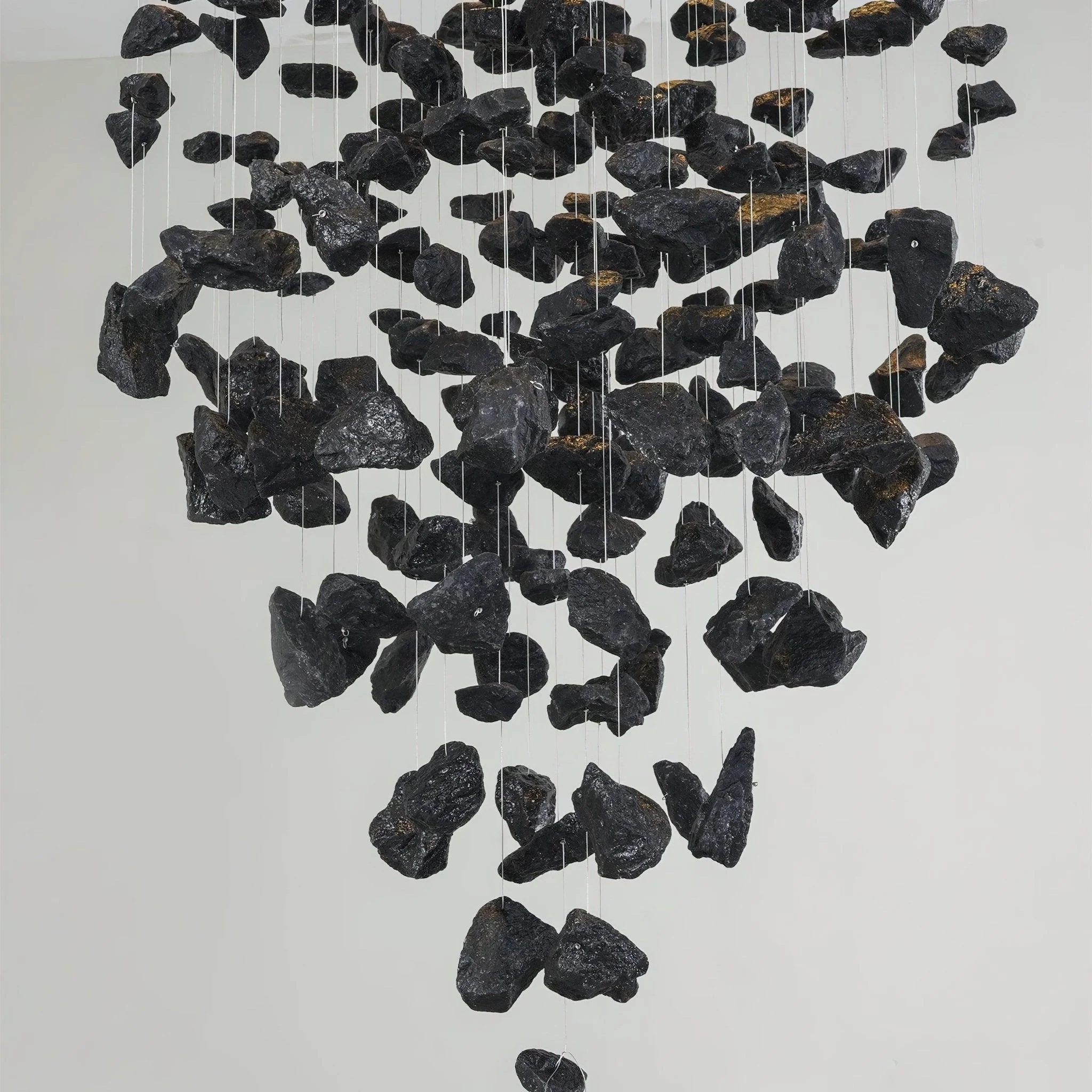
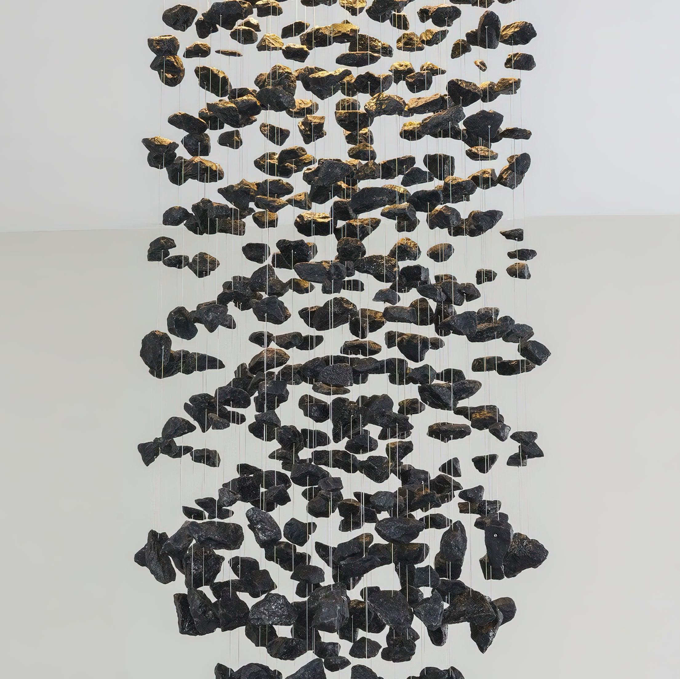
This Charcoal Chandelier G to L is a unique design piece that reflects the idea that everything in the world is connected and interrelated. Crafted from charcoal, each design is handmade and delicately expands to fill a space, creating a sophisticated architectural statement. Its minimalist aesthetic provides a stunning focal point in any room.
Notes: *Canopy default color is stainless steel silver.
Weight: Over 200 pounds, this light must be mounted on a concrete wall.
DIY customization service: Vakkerlight can customize any letter and any shape.
If you have any questions about our products, please contact us and we will reply to you within 24 hours.
NOTE*: Due to the substantial size of the lamp’s packaging, which surpasses the handling limits of standard express delivery services, we are required to utilize truck transportation for its delivery. This method ensures the safe and secure transit of your package. However, please note that the shipping time for this method is approximately 40-50 days. We advise you to consider this extended delivery period before making your purchase to ensure it aligns with your expectations and schedule. Your understanding and consideration of these logistics are greatly appreciated as we strive to provide you with the best service possible.
The same series of products, click on the link to learn more >>>
Product
Size: L 100cm x W 35cm x H 250cm / L 19.7″ x W 13.8″ x H 98.4″
Details
Material: Stone, Iron, Metal.
Light source: Integrated LED.
Kelvin range: Warm Light (3000K), Neutral Light (4000K), Cool Light (6000K).
Voltage: AC 110-240V
Mounting: Ceiling
Moisture resistance: IP 20 Damp-rated for use in bathrooms, kitchens, and covered outdoor areas.
Environment: Indoor
Body Finishes: Chrome.
Shade Finishes: Black.
Wiring: Hardwired.
Control: Compatible with common wall switches (not included).
59″ Adjustable hanging height cable, which can be lengthened as required.
Certification: Compatible with North America, Saudi Arabia, Europe, Australia Certification
Download Support
/* 样式隔离:所有样式都使用唯一的类名前缀,并应用于容器内部元素,以防止影响页面其他部分 */ .shopify-doc-links-container { /* 容器自身的样式,控制宽度和间距 */ width: 100%; max-width: 600px; /* 限制最大宽度,让它在桌面端看起来更精致 */ margin: 20px auto; /* 居中显示 */ padding: 0 15px; /* 增加侧边内边距以适应移动端 */ box-sizing: border-box; font-family: ‘Inter’, sans-serif; /* 使用 Inter 字体 */ } /* 原先包裹图标的链接,现在改为非交互式的span来保持布局和样式 */ .shopify-doc-link-item { display: block; /* 确保占据空间,以配合flex布局 */ /* 移除了链接相关的样式 */ box-sizing: border-box; } /* 整个按钮的视觉和交互样式 */ .shopify-doc-link-button { display: flex; /* 使用 Flexbox 布局图标和文字 */ justify-content: space-between; /* 将图标和文字推向两端 */ align-items: center; /* 垂直居中对齐 */ margin-bottom: 12px; /* 按钮之间的垂直间距 */ padding: 14px 20px; /* 按钮内部填充,控制高度和宽度感 */ background-color: #f7f5f0; /* 柔和的米白色背景 */ border-radius: 10px; /* 圆角设计 */ border: 1px solid #eee; /* 轻微边框 */ box-shadow: 0 1px 3px rgba(0, 0, 0, 0.05); /* 柔和的阴影 */ transition: background-color 0.2s, box-shadow 0.2s; box-sizing: border-box; } /* 由于现在只有文本链接可点击,将hover效果集中在文本链接上会更好,但这里保留了整体按钮的视觉反馈 */ .shopify-doc-link-button:hover { background-color: #edeae2; /* 悬停时的背景颜色变化 */ box-shadow: 0 2px 5px rgba(0, 0, 0, 0.1); } .shopify-doc-link-icon { /* 图标容器样式 */ display: flex; align-items: center; color: #795548; /* 图标颜色,使用深棕色系显得精致 */ flex-shrink: 0; /* 防止图标被压缩 */ cursor: default; /* 图标不可点击,显示默认光标 */ } /* 包裹文字的链接样式,确保其是可点击的区域 */ .shopify-doc-link-text-wrapper { text-decoration: none; /* 移除链接默认下划线 */ color: inherit; /* 继承颜色 */ /* 确保链接占据足够的空间作为 flex item */ } .shopify-doc-link-text { /* 文字样式 */ font-size: 16px; /* 字体大小 */ font-weight: 500; /* 中等粗细 */ color: #333; /* 文字颜色 */ text-decoration: underline; /* 保持下划线风格以提示链接 */ text-decoration-color: rgba(51, 51, 51, 0.4); /* 让下划线颜色柔和一点 */ text-underline-offset: 4px; /* 下划线与文字的距离 */ transition: text-decoration-color 0.2s; text-align: right; /* 确保文本是从右往左对齐的 */ flex-grow: 1; /* 允许文本占据剩余空间 */ display: inline-block; /* 确保 span 内部的样式应用正确 */ } /* 悬停在链接上时,下划线加深 */ .shopify-doc-link-text-wrapper:hover .shopify-doc-link-text { text-decoration-color: #333; } /* 响应式调整:确保在小屏幕上也能良好显示 */ @media (max-width: 768px) { .shopify-doc-link-button { padding: 12px 15px; } .shopify-doc-link-text { font-size: 15px; } }
/* Base style definitions */ :root { –bg-color: #f7f5f0; –hover-bg: #edeae2; –icon-color: #795548; –text-color: #333; –border-color: #eee; } .shopify-doc-links-container { width: 100%; max-width: 600px; margin: 20px auto; padding: 0 15px; box-sizing: border-box; font-family: ‘Inter’, -apple-system, BlinkMacSystemFont, “Segoe UI”, Roboto, sans-serif; } /* Link wrapper: Makes the entire button area clickable */ .shopify-doc-link-wrapper { text-decoration: none; display: block; margin-bottom: 12px; } .shopify-doc-link-button { display: flex; justify-content: space-between; align-items: center; padding: 14px 20px; background-color: var(–bg-color); border-radius: 10px; border: 1px solid var(–border-color); box-shadow: 0 1px 3px rgba(0, 0, 0, 0.05); transition: all 0.2s ease; } .shopify-doc-link-wrapper:hover .shopify-doc-link-button { background-color: var(–hover-bg); box-shadow: 0 2px 5px rgba(0, 0, 0, 0.1); transform: translateY(-1px); } .shopify-doc-link-icon { display: flex; align-items: center; color: var(–icon-color); flex-shrink: 0; } .shopify-doc-link-text { font-size: 16px; font-weight: 500; color: var(–text-color); text-decoration: underline; text-decoration-color: rgba(51, 51, 51, 0.4); text-underline-offset: 4px; transition: text-decoration-color 0.2s; } .shopify-doc-link-wrapper:hover .shopify-doc-link-text { text-decoration-color: var(–text-color); } /* Responsive adjustments */ @media (max-width: 768px) { .shopify-doc-link-button { padding: 12px 15px; } .shopify-doc-link-text { font-size: 15px; } }
Spec Sheet
Installation Guide
3D Files
Reviews
There are no reviews yet.