Description
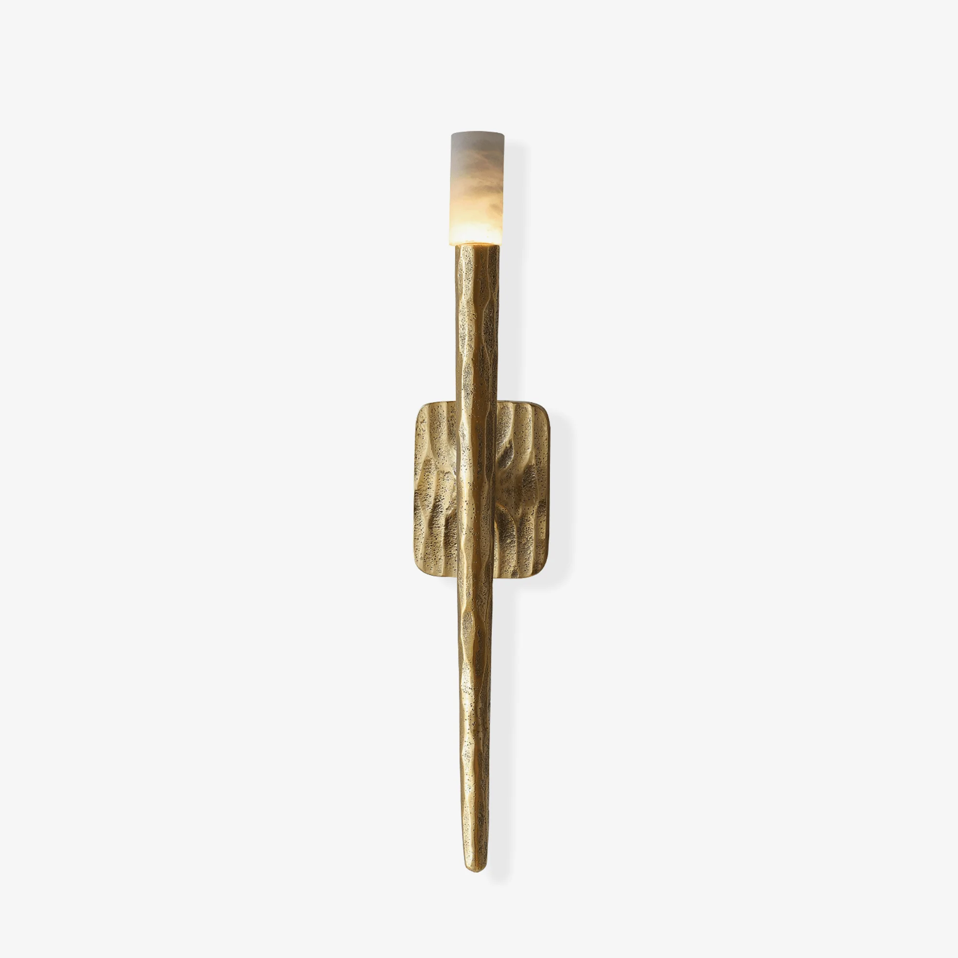
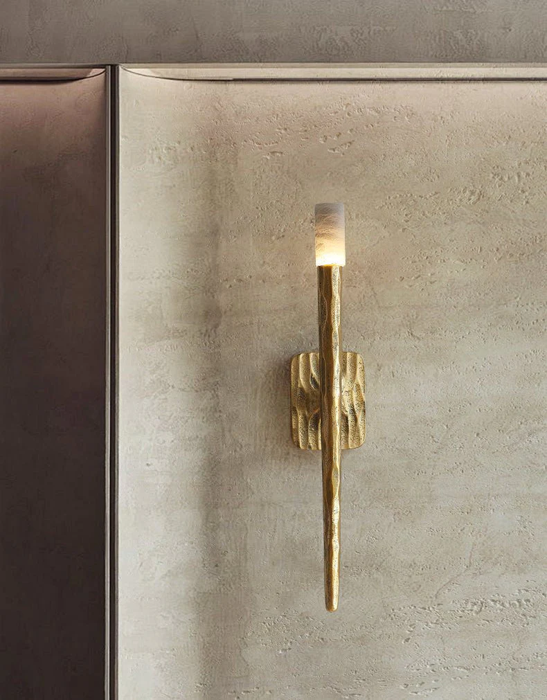
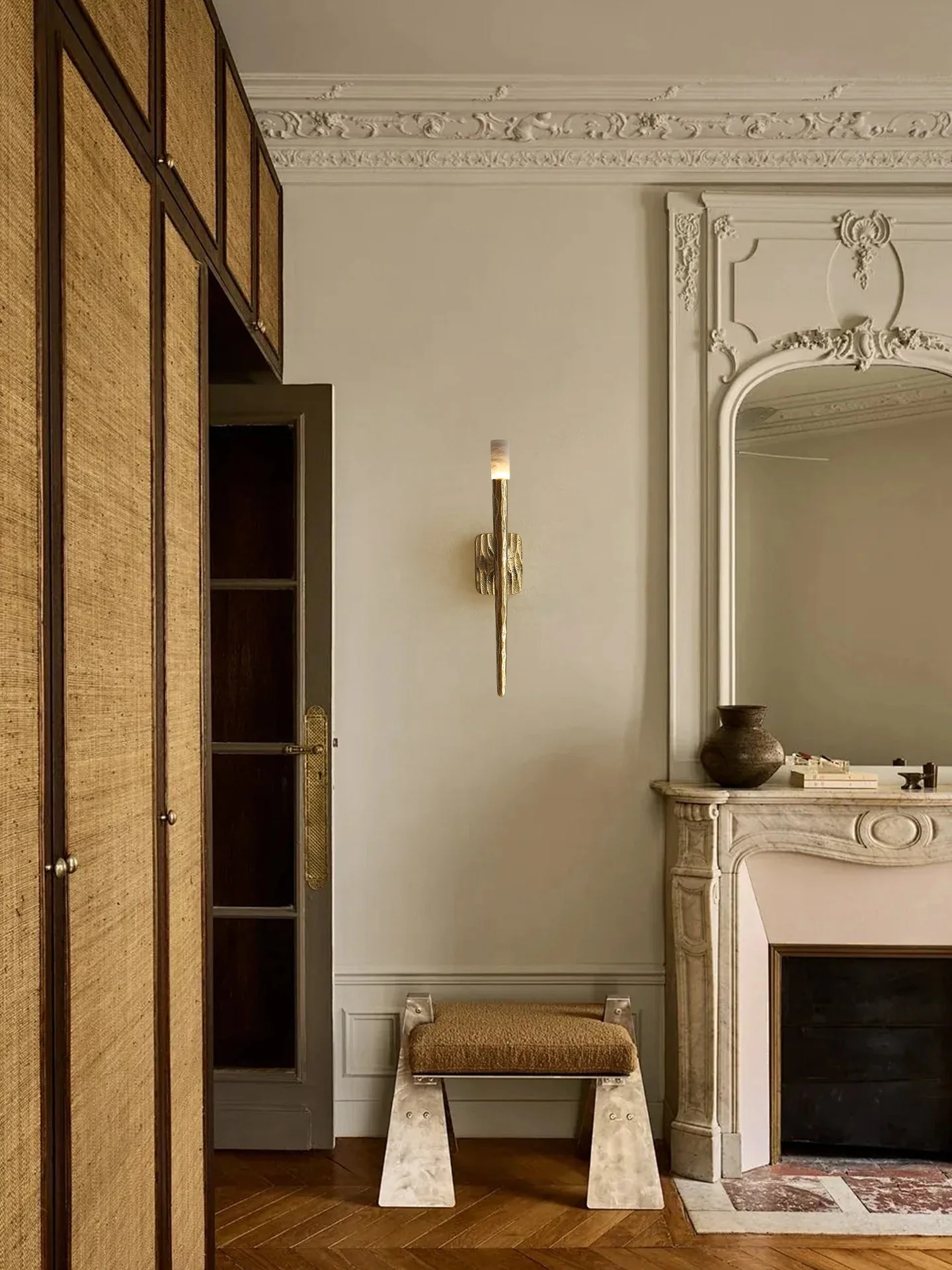
The Aurelian Sculpted Alabaster Sconce by Vakkerlight is a striking balance of raw texture and soft illumination. A hand-finished copper body, shaped with an organic, almost molten surface, extends vertically like a sculptural form, while a cylindrical alabaster shade crowns the piece with a warm, diffused glow.
When illuminated, the alabaster reveals subtle cloud-like veining, gently softening the bold presence of the metal below. The contrast between the rugged brass and the luminous stone creates a refined visual tension—both dramatic and elegant.
If you have any questions about our products, please contact us and we will get back to you within 24 hours.
Product Size
Size: Dia 11cm x H 56cm / ∅ 4.3″ x H 22″
Details
Material: Metal, Alabaster.
Light source: LED bulb or Edison bulb.
Light source base type: G9.
Voltage: AC 110-240V.
Mounting: Wall.
Moisture resistance: IP 20 Damp-rated not waterproof, for indoor use only.
Environment: Indoor.
Body Finishes: Copper.
Shade Finishes: White.
Wiring: Hardwired.
Control: Compatible with common wall switches (not included).
Switch: This switch should be connected to an external wall light switch, allowing for a controlled electricity supply.
Certification: Compatible with North America, Saudi Arabia, Europe, Australia Certification.
Download Support
/* 样式隔离:所有样式都使用唯一的类名前缀,并应用于容器内部元素,以防止影响页面其他部分 */ .shopify-doc-links-container { /* 容器自身的样式,控制宽度和间距 */ width: 100%; max-width: 600px; /* 限制最大宽度,让它在桌面端看起来更精致 */ margin: 20px auto; /* 居中显示 */ padding: 0 15px; /* 增加侧边内边距以适应移动端 */ box-sizing: border-box; font-family: ‘Inter’, sans-serif; /* 使用 Inter 字体 */ } /* 原先包裹图标的链接,现在改为非交互式的span来保持布局和样式 */ .shopify-doc-link-item { display: block; /* 确保占据空间,以配合flex布局 */ /* 移除了链接相关的样式 */ box-sizing: border-box; } /* 整个按钮的视觉和交互样式 */ .shopify-doc-link-button { display: flex; /* 使用 Flexbox 布局图标和文字 */ justify-content: space-between; /* 将图标和文字推向两端 */ align-items: center; /* 垂直居中对齐 */ margin-bottom: 12px; /* 按钮之间的垂直间距 */ padding: 14px 20px; /* 按钮内部填充,控制高度和宽度感 */ background-color: #f7f5f0; /* 柔和的米白色背景 */ border-radius: 10px; /* 圆角设计 */ border: 1px solid #eee; /* 轻微边框 */ box-shadow: 0 1px 3px rgba(0, 0, 0, 0.05); /* 柔和的阴影 */ transition: background-color 0.2s, box-shadow 0.2s; box-sizing: border-box; } /* 由于现在只有文本链接可点击,将hover效果集中在文本链接上会更好,但这里保留了整体按钮的视觉反馈 */ .shopify-doc-link-button:hover { background-color: #edeae2; /* 悬停时的背景颜色变化 */ box-shadow: 0 2px 5px rgba(0, 0, 0, 0.1); } .shopify-doc-link-icon { /* 图标容器样式 */ display: flex; align-items: center; color: #795548; /* 图标颜色,使用深棕色系显得精致 */ flex-shrink: 0; /* 防止图标被压缩 */ cursor: default; /* 图标不可点击,显示默认光标 */ } /* 包裹文字的链接样式,确保其是可点击的区域 */ .shopify-doc-link-text-wrapper { text-decoration: none; /* 移除链接默认下划线 */ color: inherit; /* 继承颜色 */ /* 确保链接占据足够的空间作为 flex item */ } .shopify-doc-link-text { /* 文字样式 */ font-size: 16px; /* 字体大小 */ font-weight: 500; /* 中等粗细 */ color: #333; /* 文字颜色 */ text-decoration: underline; /* 保持下划线风格以提示链接 */ text-decoration-color: rgba(51, 51, 51, 0.4); /* 让下划线颜色柔和一点 */ text-underline-offset: 4px; /* 下划线与文字的距离 */ transition: text-decoration-color 0.2s; text-align: right; /* 确保文本是从右往左对齐的 */ flex-grow: 1; /* 允许文本占据剩余空间 */ display: inline-block; /* 确保 span 内部的样式应用正确 */ } /* 悬停在链接上时,下划线加深 */ .shopify-doc-link-text-wrapper:hover .shopify-doc-link-text { text-decoration-color: #333; } /* 响应式调整:确保在小屏幕上也能良好显示 */ @media (max-width: 768px) { .shopify-doc-link-button { padding: 12px 15px; } .shopify-doc-link-text { font-size: 15px; } }
Spec Sheet
Installation
3D Files
Reviews
There are no reviews yet.